Ok, I really didn’t want to write this blog because I sell billboard (and other outdoor advertising space) for a living – but here is my story:
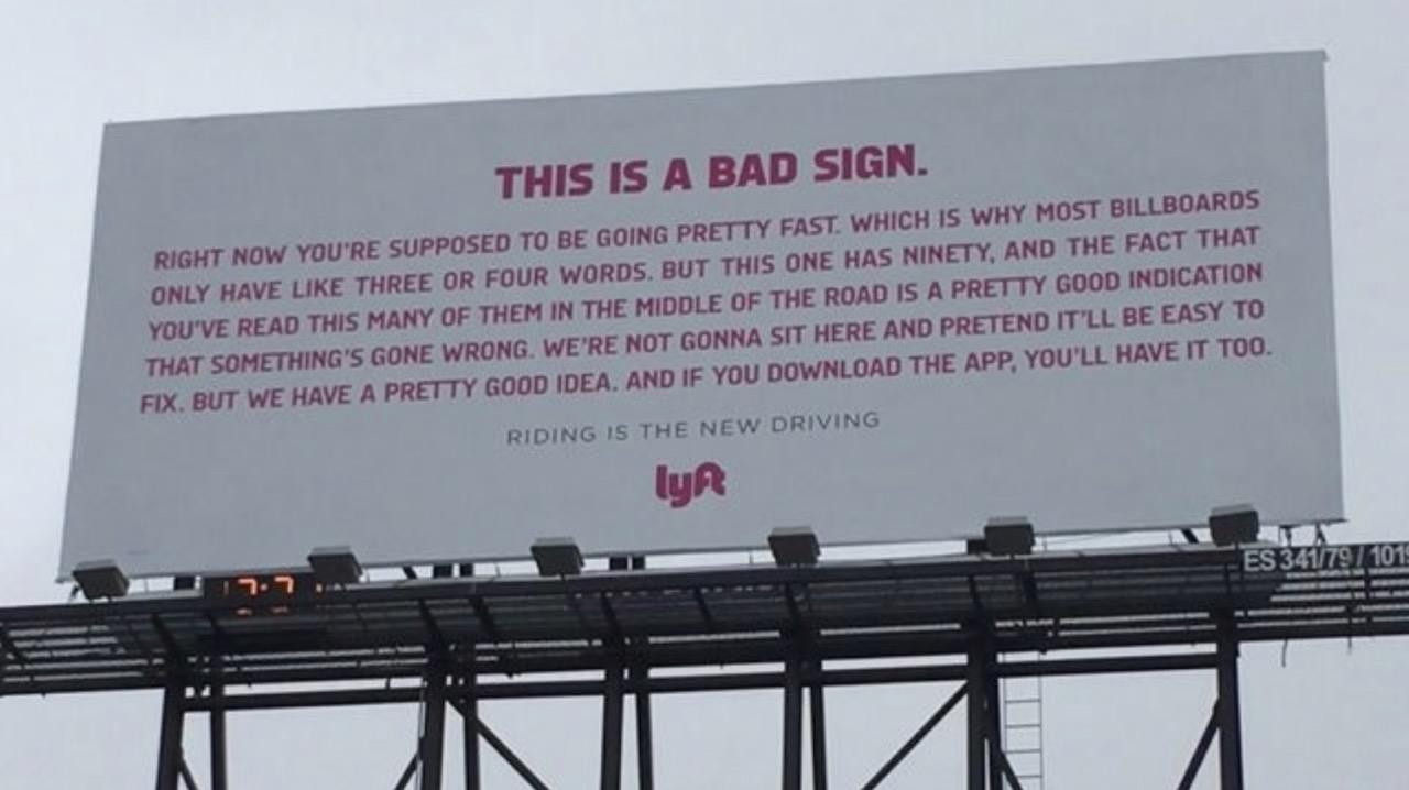
Yesterday I was driving through Providence, Rhode Island and into Boston to meet with clients and noticed how many “bad” billboard designs were displayed along I-95 and I-93 – the two major interstates in the area. When I say bad designs I mean that the ads were nearly impossible to read and (more than likely) a waste of hard-earned marketing dollars. Many of the billboard ads were over-loaded with information and the advertiser’s message was nearly impossible to read.
You might ask, how is it possible to convey your message to a driver and their passengers while “screaming” past a highway billboard at 60 – 80 mph?
When it comes to designing billboards there are a few rules you need to follow in order to maximize your outdoor advertising return on investment.
According to John Morana, President of the company Design My Billboard in Rochester, NY, there are 10 rules to follow to have a successful billboard design. Embrace these design tips and your outdoor advertising response is sure to improve:
Billboard Design Tip #1
Simplicity rules!
FACT: Uncluttered billboards usually achieve greater success. Ideally, your billboard design should consist of just 3 main components:
• A compelling image / photo
• A unique, benefit laden, emotionally charged headline
• Your name or logo – contact details are longer required – a web search will follow
Keep it SIMPLE. Prospects are zipping by at 55+ M.P.H. They have only 5-10 seconds to notice, become engaged by and process your message. Don’t make it difficult by cramming your billboard with too much stuff.
Try to keep your copy length to 7 words or less. The fewer the words, the greater the chance they’ll understand, retain and recall your message.
Billboard Design Tip #2
Use high contrasting colors
Bold, highly contrasting colors help get you noticed. Soft, mellow pastels may work fine in slick magazines but they don’t do well in outdoor advertising.
When it comes to color and designing billboards, bold is definitely beautiful.
Billboard Design Tip #3
Forget fancy font styles
Thin and/or elaborate script fonts are hard to read (and often invisible) at long distances. Use thick strokes and simple styles to increase legibility at distances greater than 1,000 feet.
Keep ample space between individual letters to avoid blurring, and avoid ALL CAPS, they’re less legible, too. Your billboard has to be read to persuade.
Billboard Design Tip #4
Use BIG font sizes
Large fonts allow reading at greater distances, giving the viewer more time to process your message. When designing billboards, minimum type size should be 18″ tall, with 3′ and taller being optimal. Extra-large type not only aids readability but adds life to your message.
Billboard Design Tip #5
Outdoor advertising requires outstanding photography
Billboard photos often wind up printing as large as your house, making high-resolution images (300 DPI min.) a must. And good Billboard Designer’s leverage that huge scale to make a BIG visual splash, displaying one central image that’s 25′ wide rather than five small images that lack emotional impact from a distance.
Billboard Design Tip #6
Laser focus on 1 key objective
You’ve only got seconds to convey your message – no time to list multiple features, lengthy mission statements, or all-inclusive contact information. Make one point with IMPACT.
Billboard Design Tip #7
Narrowly target your audience
Try to reach everyone, you’ll appeal to no one. Your target prospect has a name, a face, a neighborhood, passions, desires and needs. Ensure your billboard speaks one-on-one to their specific needs, just as you would with a friend. Establish a meaningful emotional connection with prospects, and they’ll be sure to RECALL your message.
Billboard Design Tip #8
Take it for a test drive
Show your billboard design layout to someone for 5-10 seconds. Are they able to read the entire message? Do they easily understand the concept? How about your call to action or business name? Simulating a drive-by-viewing will quickly point out simple mistakes that could clobber your response rate.
Billboard Design Tip #9
Use Story Elements to grab and keep their attention
Are your graphics and message thought provoking? Are you creating a vivid mental picture that suggests a storyline and creates drama, excitement, suspense or delight? Bored drivers love to be entertained, but quickly.
Billboard Design Tip #10
Be bold, courageous and daring!
Bear in mind… Absolutely “NO ONE” will remember “DULL”. Follow these 10 billboard design rules but break all the rest in pursuit of the memorable! Explore every possible concept, no matter how crazy it initially seems. Nutty ideas often develop into unique and highly memorable outdoor campaigns.
Billboard advertising and the popularity of Out of Home media continues to expand and grow annually even though it is the oldest form of advertising. Billboards continue to offer the lowest CPM (cost per thousand impressions) of all media types including TV, Radio, Print and Digital (on-line). What’s next? – If you would like to learn more about costs, availability and recommendations for a billboard advertising campaign anywhere in the US or internationally, contact Phil Morton at Sage Outdoor Ads for more details.

